Metal Hammer is one of the most trusted and well known magazines and brands in the music industry and in 2018, while art editor of the magazine, I was tasked with coming up with a fresh new-look for the magazine. The brief from the senior editorial team was to create a new modern vibe that would take the brand into a new phase but still importantly keep some of its rock and metal values.
Myself with the editorial have evolved the magazine to suit the ever changing industry and more importantly the readers. The reimagined Metal Hammer reflects what we feel our readers want more of - bigger and better stories, high quality writing, premium design and exclusive extras.
After several weeks of filtering ideas I created the magazine aesthetic to compliment the editorial content. Modern fonts with solid use of white space were focal points while returning to some core design skills, grids and structures that have been eroded over the years. One fo the other goals was to keep the regulars easy to work on to free up time for myself, and anyone working on it, to be more creative in other areas such as the cover and features. With the features I also wanted to emphasis two each one set the tone with big opening pages of images or typography to pull people in whether a fan of the bands or not. Images in general are bigger throughout to so show off the talented photographers and artists that are used.
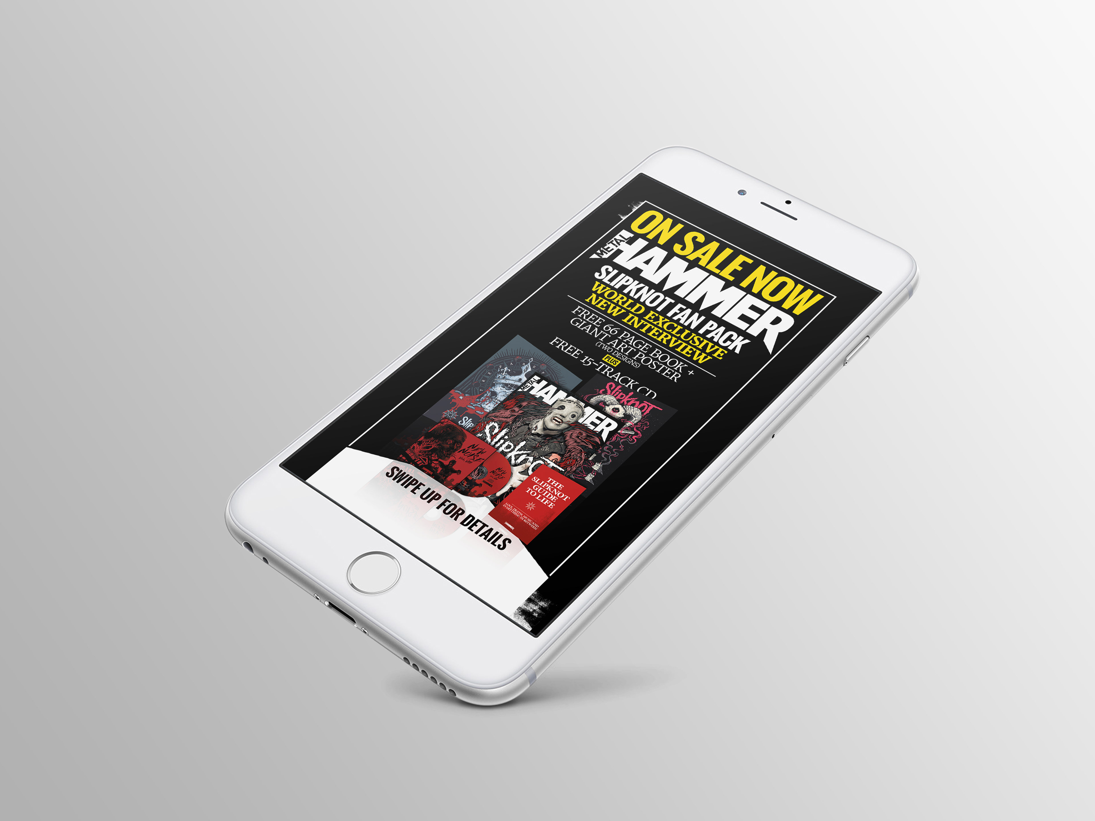
The first issue of its release featured Slipknot on the cover using a older John McMurtrie photograph and an exclusive illustration by Tom J Newell. The magazine was presented with an exclusive poster of artwork by Mark Van De Beek, a book of quotes by Slipknot given as a gift to readers and 15-track CD. This issue saw a significant rise in sales which have continued through the year since I left my role.